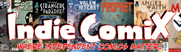
GREEN HORNET #33
Dynamite Comics
Created by: George W. Trendle & Fran Striker
Writer: Jai Nitz
Pencilers: Jethro Morales
Colorer: Kristy Swan
Letterer: Marshall Dillon
Reviewer: Derrick T. Crow
Summary: This issue see's the Green Hornet of modern day take on the “Frown Prince of Crime,” and solves the case of a mass homicide while still taking on bank robbers and looking sweet in his new armor.
*Spoilers*
Review: That was a short summary, but then there wasn’t a lot to this issue. In fact, it was pretty bloody awful. I reviewed another Green Hornet book I had actually really enjoyed last time and that was because it was a very nice homage to the 50’s cape crusaders and their wacky out of time adventures that made that era so cheesy and fun. And there was the fact that I could go into that issue without knowing anything of Green Hornet and still thoroughly enjoy it.
Jumping into the fray with Green Hornet #33 just felt like too much of a chore. As a reader of new-age comics I am accustomed to the idea that you’re not going to get all the information you need to understand the middle of an ongoing plot in every issue, that’s what the summary page is for. And that you’re also not always going to get a lot happening in an issue to consistently justify your purchase.
The thing is though there is no summary page at the front for me to get into the story, and even if I didn’t want to go through the trouble of reading it there still isn’t any sort of substance to hold onto in this book to let you breathe and figure out what is going on. It literally throws you into the middle of and doesn’t bother asking if anyone reading this is a new reader.
Also it is, from what I could gather, a single story only barely accompanied by past plot threads due to some things they kind of reference here and there. So you do get a full story in this plus foreshadowing for the next issue. The execution though is sloppy, and unfortunately I mean that literally, but we’ll get to that in a moment. Not a lot happens here as the story races from scene to scene, we’re introduced to the new Green Hornet who is… shall I say, Iron Man in teenage form. He goes to a private high school and is dating the “hottest girl in school” (as the captions pointed out), he rushes off to find his Green Hornet flying suit of armor with a built in Jarvis (well, in this comic it’s HIVE) and flies off into the night sky having Jarv—I mean HIVE hack into police chatter to go catch a criminal, The Frown Prince who has caused a mass homicide that we see at the beginning of the issue.
The Frown Prince is a theater-themed villain and Joker rip off that tries to cut a frown into his victims and spouts lame theater puns and references instead of jokes (or maybe they’re supposed to be funny? I was groaning more than anything). He has no goals here, only to serve as the issue main antagonist. He even has a lame end as he gets shot square in the face ending his much frowned-upon lifestyle (let’s see how many of you get that one). Which brings us to the biggest issue I had with this story: GH is not likeable at all; he’s a stereotypical white playboy rich kid who is more of less there to have a party instead of do his actual job. He kills villains without remorse and that is quite frankly not something I want to see with the good guy hero I am following (anti-heroes need not apply) and last I checked GH was not an anti-hero. There’s nothing to his personality, nothing to hold onto. Unless I was reading past issue of this series I wouldn’t know a single thing about this guy except he likes his girl, he kills and he has HIVE do all the work for him, and yeah that is how I feel.
I was talking to a buddy of mine about this issue and he mentioned that it all sounded like someone intentionally came up with a bad joke and wrote it down. He’s right, that’s what it is.
The dialogue is awful with golden gems such as a cop spouting: “We need to call this in. We need to call the Green Hornet.” And a group of thug looking guys claiming to be the GH’s possy yelling “SWARM!” to surround a bad guy and take him down (it didn’t work). The art wasn’t that great to look at either, the design of the Green Hornet armor quite frankly looked like bad Kamen Rider cosplay. There’s just not a lot to say on these fronts without me repeating myself.
Look, I don’t mean to bash all over this issue, I don’t even want to. I want to love Green Hornet and really dive into his franchise and nestle into everything out there, but this issue just isn’t going to be the one to do it for me. If there was anything I liked about this issue it was the idea that in this world it’s established that Green Hornet is recognized by the public as the hero and protector of Century City, which is a far cry from the resounding 20’s era story I got in the Green Hornet Special I reviewed a couple of weeks ago where he was seen as a menace. It really goes to show how far along the mantle of Green Hornet has come if you take into consideration the time skip of the 20s to the modern age. This issue just went about displaying it the wrong way, instead of featuring a GH that used a stun gun or “stinger” to put his enemies away, this one blows their heads right off without any remorse. And I don’t like it.
Final Score: 1 bad acting joke out of 5.
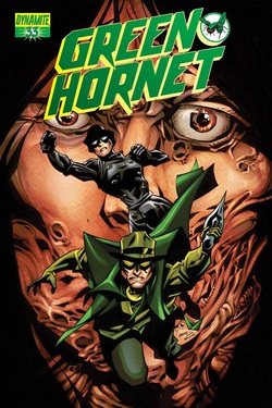
Red Team #1
Dynamite Comics
Writer: Garth Ennis
Illustrator: Craig Cermak
Colorist: Adriano Lucas
Letterer: Rob Steen
Reviewer: Warren Wesson
Summary: Part one: The First-Timers. Eddie Mellinger, Trudy Giroux, Duke Wylie and George Winburn are Red Team: the NYPD's elite anti-narcotics unit. They've taken down one drug lord after another with a careful blend of meticulous surveillance and applied violence, but their latest case has even them stumped. Their frustration leads them to take extreme measures- setting them on a path from which there can be no coming back. As they're about to discover, doing the wrong thing can be very, very seductive.
Review: Red team definition: A red team is an independent group that seeks to challenge an organization in order to improve its effectiveness.
Straight out of the gate, I really enjoyed Garth Ennis’s Red Team and will definitely be following this story.
I’ll talk about the comic and try not to spoil a thing.
“I know some cops I wouldn’t trust to judge a pie eating contest” “Yes well you just might get the feeling you’ll find a lot of cops will agree with you”
Garth Ennis is and always has been one of my favorite writers when he’s not trying to freak me out. When he keeps it real, I think that’s when he is at his best I think. That’s no jab at Mr. Ennis, I just happened to like the straight forward story telling style of this piece of work.
This story is almost as straight forward a cop drama there is.
The layout of the panels in any comic, for me, is as important as the pencils & inks. This issue number one the panels are great. Fantastic. A well laid out comic sometimes almost doesn’t need words.
The art is a new name for me. Craig Cermak. This Kubert schooled talent was grabbed by the publisher for a good reason. He’s Dynamite! So it makes sense Dynamite Publishing would want him.
Same goes for the colorist. The colours are immaculate. Color for me can be a deal-breaker. When the layouts are good, the pencils are money, if the colours are not where they should be, I prefer no color. Red Team colorist Adriano Lucas is awesome here.
So that’s the core of Red Team. Garth, Craig & Adriano … and oh yeah don’t let me forget the letterer. The unsung hero of the comic trade. No one notices an awesome letterer. No one ever notices the letterer unless they blow it. Such is not the case here with Red Team. Rob Steen is an illustrator first and foremost I believe so there is not much mystery in how he manages to put the finishing touches on this story so nicely.
Mr. Ennis serves up a good accounting of what happens when a group of cops, hard cores. Put everything on the line. Their lives. Roll the dice. Some win, some lose. Some friends don’t come home. Fed up to see the ultimate sacrifice paid only to see the bad guys go free, free to spread to spread the disease of violence, drugs, the team go vigilante. Red Team.
Ennis, Cermak, Adriano & Steen just make it so easy and so cool. I’m in for a pound.
I would like to see the Chaykin Variant cover someday just because well, Howard freekin’ Chaykin! Do I need another reason? Russ Braun, a fellow Canuck, did an exclusive subscription cover I would love to see someday, and Ryan Sook did a cover as well.
Do sign up for this tough and beautiful title.
5 Stars.
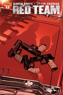
FairyQuest #1 – Single Issue
BOOM! Studios
Writer: Paul Jenkins
Pencilers: Humerto Ramos
Colorer: Leonardo Olea
Letterer: Leonardo Olea
Reviewer: Derrick T. Crow
Summary: Have you ever wondered what would happen if all the Fairy Tales lived in the same town and how that would affect their stories if they all knew one another? What would happen if they were just like us but merely living on another side of the coin? And what if their stories were like plays and everyone was but just an actor for our entertainment? Paul Jenkins and Humerto Ramos ask these very questions and bring up some interesting concept ideas in FairyQuest #1!
*SPOILERS*
Review: As an avid, longtime fan of the original Fables by Bill Willingham I wasn’t originally thrilled by the notion of yet a third series crossing the idea of what if the Fairy Tales knew each other and then came over to the real world – the second series being Once Upon A Time TV series that I have not seen, but doesn't really look all that great – but color me purple or surprised or what have you when I read this issue and was thoroughly surprised with the originality it showed and the intrigue into the daily lives of these well-known stories.
The issue begins with a mother telling her son about the story of Little Red Riding Hood and plays off from there as we move into the world of the Fables, being introduced to Fablewood, the town where every fairy tale ever lives. And the issue rightly so focuses on Red as the main character with an accurate child-friendly retelling of the story up until we’re introduced to Mister Grimm, the overseer of the stories and ruler of Fablewood. He holds them under an iron grip and reprimands anyone who dares to try and deviate from the story. Which Riding Hood does several times, though they’re small incursions so he allows them to slide.
The overall subject though of the Fables and the idea that they are constantly retelling their own stories is the most confusing thing of the issue. Do they do it every time the story is read in the real world? It sure seems that way, and is their off time the few times no one is reading their stories? I don’t understand and it’s not really elaborated on or explained. So that was in essence my least favorite part of the issue as it more or less makes explaining this premise very difficult.
We’re introduced also to Grimm’s Think Police that are the law enforcers of the stories, making sure everyone stays in line. And the Fairy Tales talk of a mythological place called Realworld where they can escape to be free from tyranny (which, admittedly, is the same premise to both Fables and Once Upon A Time), even so Paul Jenkins still finds a way to make this world feel fresh and involved, along with Humberto Ramos who gives gorgeous art to the overall story. And with this being so kid-friendly, his art style fits perfectly.
Even so, Riding Hood and the Big Bad Wolf decide to make a break for Realworld, having become friends and being tired of this mundane place they live in. I like the concept of these characters already being friends, and the fables already good friends living under a single roof, as opposed to being forced out by an evil Emperor and THEN becoming friends. This world is treated much more like a fairy tale than the more, well, real world take shown in Fables.
I’ve always liked Paul Jenkins way of storytelling; I heavily enjoyed his 2000 mini-series Sentry and he’s a very prolific writer. Humberto Ramos’s art has been a bit hit and miss with me. I enjoyed his art on Adjectiveless X-Men but not so much recently in Amazing Spider-Man, either way I found his artwork to be beautiful here. Jenkins way of telling the story makes every character likeable to some capacity, even the villainous Mister Grimm who seems like he may know much more about Realworld than he’s letting on so it’ll be interesting to see where that goes.
I heard somewhere that this comic was in fact a Kickstarter campaign and I find that so interesting that even mainstream comic companies like Boom! is looking to further their audience by utilizing the power and funds that can come from the fans wanting to personally feel as if they had a hand in creating the comics they want to enjoy. And I find it to be such a smart marketing tool, the people reading the comic will feel much more heavily invested in the story if they have a personal attachment to it, and nothing is more personally than feeling as if you had an actual hand in creating the book you hold in your hands.
One more complaint would be that after the first issue I still have no stinking clue as to why the book is called FairyQuest, which isn’t necessarily a good thing. If I am trying to get someone interested in this book from issue one, I would like to be able to tell them exactly where the title of the book came from and how it relates to the story. From how this issue is set up, I could imagine me discussing with a new reader about it and then they being confused as to why it’s called FairyQuest then.
Overall though, this was a pretty solid first outing, everything was gorgeous and I am ready for the next issue to come barreling out. Bring it Jenkins and Ramos, I want to see Riding Hood and Wolfie’s amazement at what I’m assuming will be a big city in Realworld once they get there.
Final Score: 4 deviations from the original story out of 5.
Charnel House #1
Broken Voice Comics/WesHuffor.com
Artist: Wes Huffor
Writers: Chris Hicks, David AJ Berner, Dave Seliger, Mark Rush, Gama Flores, and Kevin Huff
Letters: Richard Nelson
Colors: Anna Wieszcyk, Matt Slay, Thomas Smith
Reviewer: Robert McClelland
Summary: 5 chilling stories from cold gun-noir to blood curtling horror.
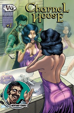
Review: Now by this point in time, you've probably heard of Wes Huffor. Who's a big Horror enthusiast himself, and cause of that is how we have Charnel House. And if you haven't heard of him, where you been? Under a rock!? Well at least now you are going to get a bit of an education! And as you might have noticed, Wes is about the only artist on this book which actually has quite a few stories to it. Which is pretty awesome as it shows his dedication to the Horror genre. Not to mention all the work Richard Nelson put in on this book for the lettering aspect. Now as for Mortimer Tombes.... That man is just plain creepy right off from the start. Especially since he appears multiple times through out the book. Which as shown on the cover really sucks for one beautiful woman!
Charnel House kicks off its collection of stories with one called: What if There Was No God.. This would more than likely rile up a huge amount of religious types. At least the ones who are of the hardcore variety anyway due to what goes on in the story. And you can tell right off the bat how douche baggery the scientists are when they are getting questioned about their final stance on God. Heck its like they were practically screaming “We want War!”. I imagine that was the writer, Chris Hicks' very intention. Now I also found myself thinking The Pope was being a bit of a douche bag too during the conference that eventually happens. Not to mention quite curious about the main nameless character of the story who's apparently been charged with leading an attack on the Religious sect. Despite the shortness of this story, I wouldn't mind seeing more of it. Because I would like to see where things go after what happens with The Pope. Although part of me can imagine how crappy things would get. And to be honest when I first read this. I really didn't think the transition to Mortimer after the story's abrupt ending was all that smooth. But after reading again, I find that I was wrong. Although I honestly wouldn't want him around any bodies of dead friends or family. As again, the man is just plain creepy.
And moving right along into Landslide. This story introduces us to Gama Flores, who shows just why its a bad idea to attempt to have a night of fun with a chick you don't know. And just why you should have a night of fun with someone you know to a point isn't going to leave you with a wrecked home and your body cut up and possibly missing something from the inside the next morning. And where as we didn't get much color in the first story, this one has plenty of it. Which to me in my opinion rather makes Mr. Unfortunate and his One Night Floozy look rather creepy. I'd rather think there's a lesson to be learned in all this!
Mad World leads us away from one unfortunate soul to another with possibly even worse luck than the last man. And by the time all is said and done. I'm left rather curious as to how he manages through everything! Just goes to show why you should always trust those bad feelings and just stay in bed. Usually are pretty accurate. Although I honestly expected the more annoying character who pops up in this story to live. The writing duties is handled by Mark Rush, and he'll certainly leave you with a question or two of how exactly things happened. And why they did happen. I know I'm curious about all that! And poor Mortimer, the man's cold is getting the best of him it seems. Hopefully whatever that hot Nurse gave him won't leave him too badly messed up!
Dave Seliger brings us a story in The Fugue State. Although I'm not entirely certain of what's going on with the main character in this short story. Other than possibly being a murderer? But that drug his friend used to help with a memory would probably be one heck of a great use in real life if something like it could be made. So kudos to that potential idea becoming a reality! The colorist who you may wind up wanting to see more of is Matt Slay.
Before I get to the next short story, there's what appears to be an ad for something called Spook City U.S.A. Something that seems like it would make for a great story to read. I know I'd go here to become a Werewolf if it existed! That is if I managed to live through any potential threats by other Monsters who reside here. Moving on to Mitch's problems in Speakeasy, now you wouldn't think he would have problems at first. But unfortunately for him is boss turns into a total douche bag. A lesson for why you shouldn't introduce your soon to be wife to your criminal level boss. I don't know if Wes Huffor has ever seen the troll memes on Facebook, but I swear Mitch winds up having one of those kinds of faces at one point during this story. Although due to certain events I can see why he would have a moment like that. I kind of wonder if Wes and Speakeasy writer David Berner intentionally saved this story for last. When you get to this story, you'll see why I find myself wondering that. Mitch's boss also kind of reminded me of the Marvel character The Kingpin. Only I imagine he would have slightly more respect for another man's woman. Course I could be wrong. I like how Justice in a sense is gained at the end of this. Although if you are offended by nudity, you won't like this last story. And Mortimer, I'm sorry dude but I don't want to be anywhere near you. Even in death. As I mentioned earlier you are just way too creepy! So if you're looking for a great collection of Creepy/Horror tales. Pick yourself up a copy of Charnel House!
5 out of 5 Stars
Broken Voice Comics/WesHuffor.com
Artist: Wes Huffor
Writers: Chris Hicks, David AJ Berner, Dave Seliger, Mark Rush, Gama Flores, and Kevin Huff
Letters: Richard Nelson
Colors: Anna Wieszcyk, Matt Slay, Thomas Smith
Reviewer: Robert McClelland
Summary: 5 chilling stories from cold gun-noir to blood curtling horror.
Review: Now by this point in time, you've probably heard of Wes Huffor. Who's a big Horror enthusiast himself, and cause of that is how we have Charnel House. And if you haven't heard of him, where you been? Under a rock!? Well at least now you are going to get a bit of an education! And as you might have noticed, Wes is about the only artist on this book which actually has quite a few stories to it. Which is pretty awesome as it shows his dedication to the Horror genre. Not to mention all the work Richard Nelson put in on this book for the lettering aspect. Now as for Mortimer Tombes.... That man is just plain creepy right off from the start. Especially since he appears multiple times through out the book. Which as shown on the cover really sucks for one beautiful woman!
Charnel House kicks off its collection of stories with one called: What if There Was No God.. This would more than likely rile up a huge amount of religious types. At least the ones who are of the hardcore variety anyway due to what goes on in the story. And you can tell right off the bat how douche baggery the scientists are when they are getting questioned about their final stance on God. Heck its like they were practically screaming “We want War!”. I imagine that was the writer, Chris Hicks' very intention. Now I also found myself thinking The Pope was being a bit of a douche bag too during the conference that eventually happens. Not to mention quite curious about the main nameless character of the story who's apparently been charged with leading an attack on the Religious sect. Despite the shortness of this story, I wouldn't mind seeing more of it. Because I would like to see where things go after what happens with The Pope. Although part of me can imagine how crappy things would get. And to be honest when I first read this. I really didn't think the transition to Mortimer after the story's abrupt ending was all that smooth. But after reading again, I find that I was wrong. Although I honestly wouldn't want him around any bodies of dead friends or family. As again, the man is just plain creepy.
And moving right along into Landslide. This story introduces us to Gama Flores, who shows just why its a bad idea to attempt to have a night of fun with a chick you don't know. And just why you should have a night of fun with someone you know to a point isn't going to leave you with a wrecked home and your body cut up and possibly missing something from the inside the next morning. And where as we didn't get much color in the first story, this one has plenty of it. Which to me in my opinion rather makes Mr. Unfortunate and his One Night Floozy look rather creepy. I'd rather think there's a lesson to be learned in all this!
Mad World leads us away from one unfortunate soul to another with possibly even worse luck than the last man. And by the time all is said and done. I'm left rather curious as to how he manages through everything! Just goes to show why you should always trust those bad feelings and just stay in bed. Usually are pretty accurate. Although I honestly expected the more annoying character who pops up in this story to live. The writing duties is handled by Mark Rush, and he'll certainly leave you with a question or two of how exactly things happened. And why they did happen. I know I'm curious about all that! And poor Mortimer, the man's cold is getting the best of him it seems. Hopefully whatever that hot Nurse gave him won't leave him too badly messed up!
Dave Seliger brings us a story in The Fugue State. Although I'm not entirely certain of what's going on with the main character in this short story. Other than possibly being a murderer? But that drug his friend used to help with a memory would probably be one heck of a great use in real life if something like it could be made. So kudos to that potential idea becoming a reality! The colorist who you may wind up wanting to see more of is Matt Slay.
Before I get to the next short story, there's what appears to be an ad for something called Spook City U.S.A. Something that seems like it would make for a great story to read. I know I'd go here to become a Werewolf if it existed! That is if I managed to live through any potential threats by other Monsters who reside here. Moving on to Mitch's problems in Speakeasy, now you wouldn't think he would have problems at first. But unfortunately for him is boss turns into a total douche bag. A lesson for why you shouldn't introduce your soon to be wife to your criminal level boss. I don't know if Wes Huffor has ever seen the troll memes on Facebook, but I swear Mitch winds up having one of those kinds of faces at one point during this story. Although due to certain events I can see why he would have a moment like that. I kind of wonder if Wes and Speakeasy writer David Berner intentionally saved this story for last. When you get to this story, you'll see why I find myself wondering that. Mitch's boss also kind of reminded me of the Marvel character The Kingpin. Only I imagine he would have slightly more respect for another man's woman. Course I could be wrong. I like how Justice in a sense is gained at the end of this. Although if you are offended by nudity, you won't like this last story. And Mortimer, I'm sorry dude but I don't want to be anywhere near you. Even in death. As I mentioned earlier you are just way too creepy! So if you're looking for a great collection of Creepy/Horror tales. Pick yourself up a copy of Charnel House!
5 out of 5 Stars
